Neo
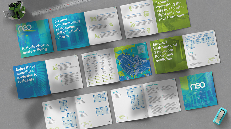
Originally constructed in 1912, this 11 storey heritage office tower underwent a complete restoration to provide much-needed space in Vancouver’s hot real estate market. As the pandemic has raged on, the need for office space downtown has decreased dramatically with more and more employers opting to have their employees work from home. The Edwardian architectural details found inside the building were the starting point for the creation of Neo’s brand identity. The figure-eight design—which can be found on the building’s facade and around the elevator doors—was used to create the logo which follows the rounded forms of the motif and was converted into a repeatable vector graphic that can be seen used throughout the medias found in this project. The colour palette was inspired by the target market and the youthful, outdoorsy vibe they project.
