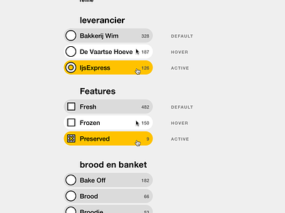
eCommerce filters default / hover / active states
Sticking with a limited color palette and large, blocky hit areas, the goal was to make filter states high-contrast, clearly differentiated, and clickable, while aligning to the visual brand style.
See the full case study on the design of the visual identity, marketing website, and eCommerce platform design:
More by Meng He View profile
Like
