Rebranding skincare line


Hello there !
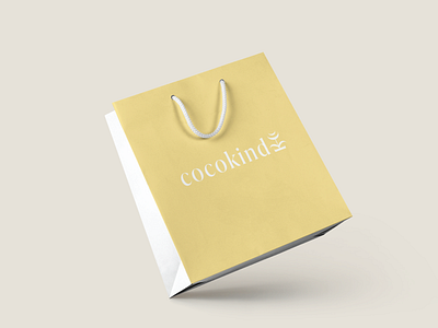
These are stationery and packaging designs for the “Rebranding a skincare line" passion project.
The concept aims to underscore the brand's commitment to kindness in its product dealings. The flower integrated into the logo cleverly incorporates the letters "c" and "k". The stem and leaves subtly form the vertical stroke of "k", while the top of the flower elegantly shapes two "c"s. This symbolism not only embodies the essence of kindness but also aligns harmoniously with nature.
Work inquiries: For any business inquiries send an email to myr.nk.design@gmail.com
Instagram: studio.myrnkdesign
