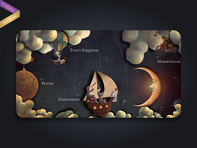
The Neverlands - An Immersive Experience
For this project, an incredible amount of time was invested in the storytelling behind the illustrated screens and how users would travel through each of the main venue pages.
The correct balance of elements on screen and how the elements behave on-scroll was one of the two greatest challenges we faced.
The second challenge, and perhaps an even greater one, was how to give users a good, clear navigation experience on a website where the client wanted to prioritize imagination and inspiration above all.
We wanted to simplify the site structure as much as possible, with the site being so graphically intense and visually nonconventional. Our main site nav uses the idea of a navigation chart and is represented by a dangling star as a nav icon.
Simple in execution, but again focused on the illustrations.
Learn more about this project at our website
