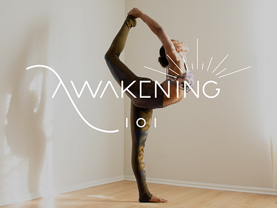
Awakening 101 Branding
This was an unused logo concept for our client Awakening 101. Even though it wasn’t the final direction, there are many aspects about it that we were partial to as designers. With the free-flowing nature of the “A”, it provided a feminine and minimal appeal while still functionally creating a framework for the “101” to align to.
More by Ahvay Creative Studio View profile
Like
