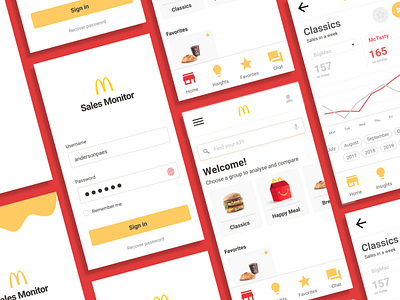
McDonalds Sales Monitor
Here is the app I designed during the Google UX Certificate course. Let me tell you a little more about it.
My prompt on Google UX Certificate was design a sales monitoring app for a large fast food chain. I thought of design this prompt locally, allowing comparisons between products to help each restaurant to analyse and increase their sales.
I chose McDonalds for this project because it is a big company with a data culture. Gartner recent studies shows many companies are still not ready for data analytics and there is also a interesting trend: less dashboards, more storytelling with data!
// Read more about this project on Medium @andersonpaes
More by Anderson Paes View profile
Like
