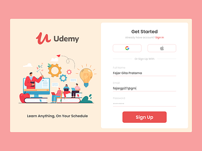
Udemy - Sign Up
Hallo there :)
This my first exploration challange and i choose sign up page from Udemy for my exploration.
Why Udemy sign up page?
Because they has many interest part to explore, such as too large white space and etc.
What i do for redesign it?
I choose simple and colorful theme for giving freshness. I use old logo from Udemy because match for theme. And then I made style such as choose color, make typography, make component and etc. After all prepared, I start to make the design.
**********
Illustration from freepik by pch.vector
**********
My Sosial Media Accounts: Linkedin
**********
More by Fajar Gita Pratama View profile
Like
