GetIn Investment
Hey folks,
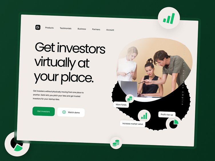
I have designed this wonderful and elegant landing page user interface design. The motive of the UI is to provide a minimal and friendly user experience where a user can easily get investors for their startup ideas or well-grown business virtually.
📚 Typography - Poppins(Heading and subheading), Inter(paragraph and contents). Both the typefaces are popular and easy to read. In terms of legibility, both typefaces stand out.
🌈 Colors - Orange shade(symbolizes creativity, thinking, and ideas) and Green shade(symbolizes success, harmony, and safety)
👉You need a second to show some love by tapping the ❤ button and give valuable feedback. Peace 😉!
🎉 Portfolio:
