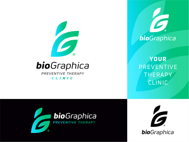
Logo design for PREVENTIVE THERAPY CLINIC concept 2.
This is the second concept for this clinic. The task is to try to convey the idea of such a preventive treatment.
This is not an easy task. You can draw an original, beautiful shape, but will it be appropriate for this particular direction? Finding the right look is not easy.
In this version, the iG leaflet monogram is created.
It also resembles a hand with a finger upward as a symbol of high quality treatment and good health.
Added dynamics, which is quite appropriate for progressive treatment, active and healthy lifestyle.
Which concept do you like better than the previous one or this one? Which image would be more appropriate in your opinion for biohacking?
More by Vladimir Pechonkin View profile
Like
