Attic | Vintage shop - Product details
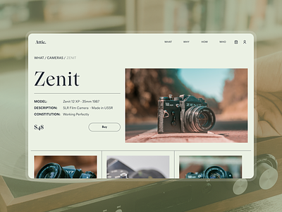
Hello guys! We've recently presented our concept of a landing page for a vintage store Attic. To continue the topic, we are glad to present a product page. Here you can see a page with a Zenith camera.
This design emphasizes the rarity of the products that are sold there. It also expresses the peculiarity of both products and customers who are interested in vintage things. Typography focuses on provoking emotion in the customer, but at the same time does not distract their attention, so the product is the main thing.
Here the user sees a brief description of the product, the main photo, as well as the rest of the photos in the carousel. This info is enough for the user to understand whether this product is suitable for them or not.
Do you like the design?
Like it? Don't forget to follow Axicube! ➡️
You can also find us here: Instagram | Behance | Linkedin | Facebook
May the Force of UI/UX be with you!

