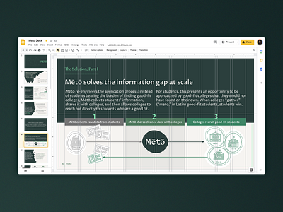
Mētō Google Slides Grid – Fundraising Presentation
Just like how Meto is solving the education and information gap at scale, design is only successful if the solution can be maintained and scaled by the team—even if they don't have an in-house designer.
With that in mind, grids, colors, slide backgrounds, and text styles are set up to demystify the design process—slides should continue looking polished as long as images and text align to the grid.
Reusable components (map pieces, custom iconography) can be re-arranged like puzzle pieces to help to illustrate a myriad concepts now and in the future.
Full case study on creating a visual identity, fundraising presentation, and website for Mētō
More by Meng He View profile
Like
