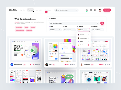
Dribbble Redesign - Search Page
Hey Dribbblers! 👋
I decided to make the dribble search page a bit more attractive, and after a few hours of designing and executing various models, this is the result I was able to get.
I believe it's fantastic! What are your thoughts? Do you think it's appropriate?
Sources
Tranmuatritam - https://dribbble.com/shots/16635202-Nunito-Hero-header-v-3
Golo - https://dribbble.com/shots/16612623-Messenger-Editor-Cards-UI
Tranmuatritam - https://dribbble.com/shots/16434886-Nunito-Hero-header
Manuel Rovira - https://dribbble.com/shots/15319401-NFT-Store-Desktop
Follow me on Instagram to see more UI/UX Content.
We are available for new design project : 📩 Work With Us: Aceagency.design@gmail.com
More by Ace Agency View profile
Like


