Personal Branding
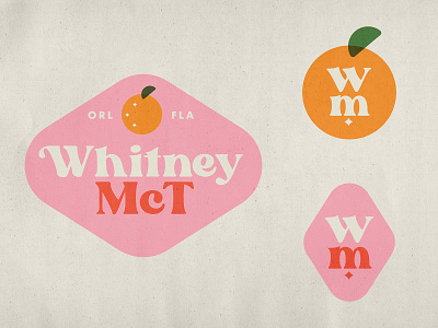
A continuation of my previous shot, although I decided to go in a completely different direction, and opted to use a font called Blanche Sage by Sans & Sons. Color palette stayed the same, though I added a touch of my home state with a simple orange shape. Grabbed a texture from the Retro Supply pack Paper Boy to help give it a vintage texture and I'm pleased with where it's at so far!
More by Whitney McTiernan View profile
Like
