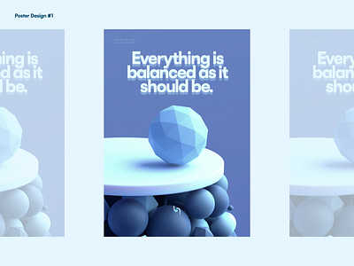
Poster Design #1: Balance
I made an abstract render on New Year's Eve last year and it turned out to be really good to repurpose it. I made this as a retro-inspired poster design (it looked almost too modern though but I guess my intention is to combine future and past without much effort, I think I already did some effort, just late) and not much meaningful than that (other than I used Thanos' words already LMAO).
It's almost next year's eve and time will tell if our next year will really shine. And that's all I have to say about it other than the render is really calm. Forgot that Satoshi is the font I used for this poster design.
More by Harole Ethan View profile
Like
