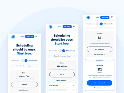
Calendly - Pricing Page Redesign (Mobile)
Webstacks 🤝 Calendly
We recently launched Calendly's new pricing page. Not only is this a high traffic page that's viewed by millions of people a month, but it touches every department in Calendly.
We take responsive design seriously
For every page we provide:
Desktop
Tablet
Mobile
As well as extensive functionality mocks and notes for smaller breakpoints.
Challenges & breakthroughs
Calendly's pricing tiers each have quite a bit of information - ranging from whether a feature is included (marked by a checkmark) to longer copy.
The challenge was working with this nested information and optimizing it for mobile.
Their pricing page before the redesign was miles long on mobile once a panel was expanded. I found the best approach was to minimize effort needed to traverse each category by collapsing the panels by default on mobile. This allows someone to quickly understand all of Calendly's offerings and give them the power to make the decision of which category to view first.
Variants
We're currently testing 3 different versions of the pricing page. Make sure you check it out here.
---
Interested in working with us?

