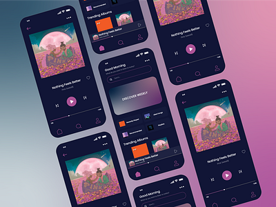
Music Player App Design
This was day 009 of the 100 day UI design challenge, for this design I chose a dark theme with hints of vibrant pink colours and white. I wanted to create a very simplistic app that had all of the necessary features, and additional features that make music apps stand out.
Having a like button beside the songs was very important, as well as the 3 button drop down. Finally I wanted the song to be shown on almost every page of the app at the bottom beside the home, search, and profile buttons. I personally like when music apps do this, it makes it so much easier to change the song or pause it no matter where I am on the app.
Overall I am really pleased with this design, and would love a music app with this colour theme to it.
More by Jen Drews View profile
Like
