Aksel Mentor Profile Components
Designing for trust.
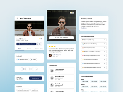
We need a lot of information to ensure our user book the mentor. Previously, we designed our mentor cards without separated profile pages to shorten product development time. Our first design in the MVP has a few area for improvement, mentor cards contain too much information that can cognitively burden the user and mentor’s additional information is designed very simply so it is less attractive with only a pop-up text box.
Against The Miller’s Law
Due to the need for a lot of information, we decided to create tabs to minimize the effect of Miller’s Law : “The average person can only keep 7 (plus or minus 2) items in their working memory.” So, we tried to organize content into smaller chunks to help users process information easier by reducing their cognitive load.
Note: This is one of my exploration for my internship work at Aksel. Read more about my case study for Aksel Career Mentoring Web App.
Got interesting project? Wanna discuss?
Really interested to work on unique digital product that tackles unique problems — Hit me up at naufanakbar@gmail.com🤙
