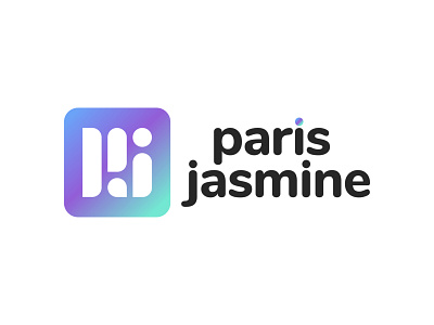
PJ Paris Jasmine Logo
One version of a logo for a fictional, creative agency.
I have recently taken on my first ever paying brand design clients, and I enjoyed the process so much, I thought I'd experiment with my own hypothetical logo.
The starting point for this design was to create an icon based off the initials PJ that scales well, and feels playful, bright and current.
Next, I searched for a font that complimented the feel of the icon initials; tweaking the vectorised font a little, such as matching the circular tittle in the icon.
In the learning process, I tried to focus on balancing the negative space of the logo. The choice to stagger the text wasn't my first option, but when I left-aligned the paris and the jasmine, the j's tittle overlapped with the bottom of the p, so I reverted to the above. (I have a horizontal version of the logo which I'm happy with as an alternative. See white version uploaded in separate dribbble.)
Feedback is more than welcome, thanks!
