Dynamic Equipment Services: Brand Identity - Identity System
The owner of Dynamic Equipment Services, Kirk, wanted his business to look a cut above the competition, but not to come across as too modern or snooty.
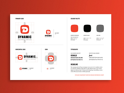
And since his target audience consisted mostly of males aged 50+ — licensed in heavy equipment machinery usage, living and working outside of major cities, making $100k a year+, who liked attending country fairs with their families and spending a Sunday afternoon cleaning under the knobs of the radio dial in their 65' Chevy with a Q-tip — I took a simple, bold, and nostalgic approach with the identity, reminiscent of logos from vintage automotive and heavy equipment brands.
Kirk was given several colour options, any of which would distinguish his brand from its competitors. In the end, we chose Pantone Bright Red C for its energetic warmth and fearless grit. I think it reminded him of Harley Davidson.
Furthermore, since the company was just starting out, two cost efficient typefaces supplied by Google Fonts were chosen to be used for business communications. This would make things easy peasy for Kirk if he or his bookkeeper ever needed to install the brand typefaces on a new computer, since they could download them again straight from Google.
Project Services Included:
Brand Identity System
Creative Strategy
Visual Identity System
Business Stationery (Print)
Brand Guidelines
