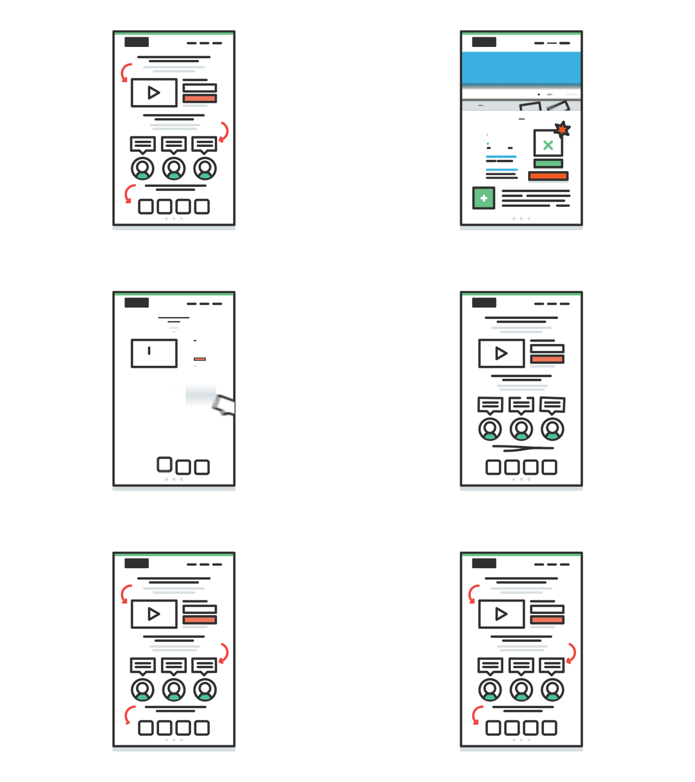
Wagepoint Web Build Animation
Okokok
So I'm really starting to try to animate more now. This is my first time doing something like this I had a lot of advice from @Latham Arnott and @Andrew Embury yay
The idea here is that we redesigned wagepoint.com and wrote a blog post about the results (higher conversions) and I wanted to make the featured image something that showed we stripped the site down, focued it, and made it easier to understand etc.
Like I've said in the past, this is really still one of my first projects in after effects other than some tutorials so I'm open to feedback. It was fun organizing layers and doing all the meticulous setup before animating. I think that helped a lot with this.
Check it out @2x :)
More by Kirk! Wallace View profile
Services by Kirk! Wallace
Like
