Back To Blue
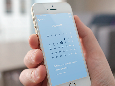
A shot of the calendar screen. I also moved back to a blue shade so the app has more of a calming feel to it. The pink was way to flashy! Real pixels in the attachment...
Like it more? Any feedback will be loved!
More by Zan Lazarevic View profile
Like

