DailyUI 21: Dashboard

This was a challenging one. A hell lot of research goes into designing a dashboard. It should be intuitive and understandable, even to the non-technical users. Sometimes, it might happen, I am able to understand the insights of the data but the other person isn't.
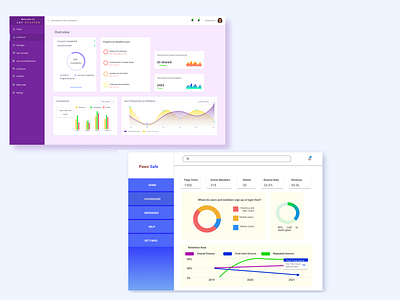
The first one is the dashboard for an online art and design learning website and the second one is the dashboard for an animal rescue volunteer website. Is this design intuitive enough? Let me know in the comments and feel free to suggest things to improve.