Personal Logo
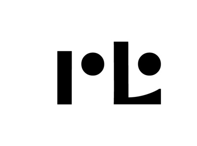
While doodling my initials, I noticed that with some art deco-styled modern-font serifs, and exaggerating the size of the ear of the "r", my name formed a bit of a smirk. I abstracted the process over and over, removing the serifs and adjusting placement to read short, simple, and sweet. Let me know what you think!
