io
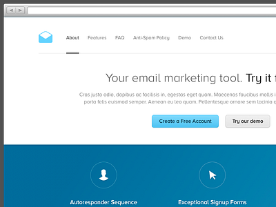
I started on an initial concept for a new client. I'm trying to keep things very clean and minimal, with a subtle bit of of depth in places. I'm still pondering over the main accent colour, but I liked how vibrant the blue looked against the white.
Be sure to check out the attachment. Hit @2x for a bigger preview.
—
Twitter: @jamesm
More by James View profile
Services by James
Like


