Zero's Onboarding Concept


Hello! Welcome to my case study for a design concept for the popular fasting app "Zero".
Introduction —
For this case study, I was challenged to pick an existing app and make an onboarding experience for a user that is 70+ years old. The designs needed to convey simple instructions for navigating around the app. This onboarding experience helps the users to understand the features of the app. This tutorial would be given to them when they first use the app and anytime the user selects the help button.
Step 1 — Goals
✅ Make an onboarding experience easy to use for a 70+ year old
✅ Provide a clear explanation for the possible options
✅ Craft easy to use options for progressing through the tutorial
✅ Allow the user to be able to exit the tutorial whenever they wish and restart with ease
Step 2 — Research & Review
I reviewed Zero's UI and selected a handful of important features to cover in this onboarding experience. If this was a real project, I would want to cover the most important and most used features of the app. I would gather this information via user-testing and then make the onboarding experience from there.
I also researched on Dribbble's website for various onboarding designs and took note of their strengths and weaknesses.
Step 3 — Sketch
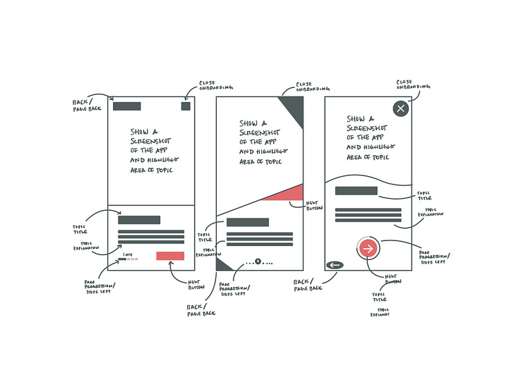
I started sketching some ideas I had for what the onboarding experience would look like and what I've seen via research and personally going through apps that have these features. I tried to simplify the steps and put myself in the shoes of a 70+ year old. I didn't want it to have too many obstacles in their way and I wanted the pages to be easy to understand and navigate.
Step 4 — Exploration
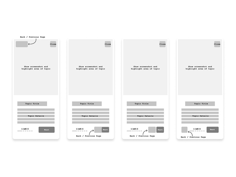
From my research and sketches, I started creating wireframes and surface compositions. I started mapping out the flow for the pages and I made multiple iterations along the way. I reflected on my goals throughout this process and made sure it would be easy to understand. I had other people review my wireframes and get their thoughts and opinions. I continued exploring and designing.
Step 5 — Design
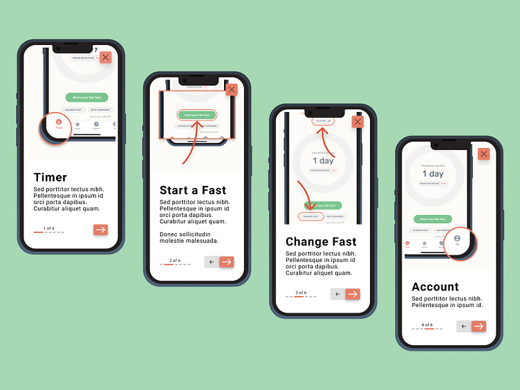
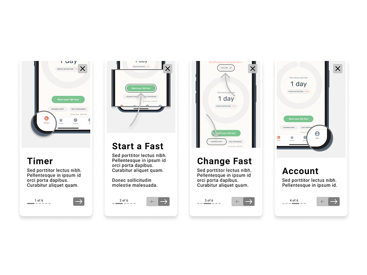
Now that I have a set wireframe, I started adding text, and color to my design. I tweaked my wireframes, text, and color throughout this process and made sure they were aligned with my goals and research. The most time spent on this project was trying to figure out how to "preview" the app and show certain features. I wanted the features talked about to be highlighted and stand out from the rest of the app. I used blurring, enlargement, and other techniques to show which feature was being talked about.
Step 6 — Prototype
I created a prototype of my designs at this point and started testing out the pages and how they would work together. If this was a real project, I would want to test this with actual users and get their feedback. I continued to modify my designs after I gathered more information from the prototype. You can view the prototype here!
Step 7 — Iteration
If this was a real project, I would want to test out my wireframes early on with low-fidelity prototypes and get feedback to iterate the sketches and wireframes. This iteration process is crucial to excellent designs. Listening to customers and gaining their feedback really make apps stand out amongst the crowd.
Conclusion —
I really enjoyed doing this project and I hope you have enjoyed reading through this case study. I feel that this UI will help the older generation understand how to use the Zero app and avoid frustration and confusion.
If you would like to review the Figma file I used for this project, check it out here! This case study took me 3.5 hours to complete. Enjoy!
Hello! Welcome to my case study for a design concept for the popular fasting app "Zero".
Introduction —
For this case study, I was challenged to pick an existing app and make an onboarding experience for a user that is 70+ years old. The designs needed to convey simple instructions for navigating around the app. This onboarding experience helps the users to understand the features of the app. This tutorial would be given to them when they first use the app and anytime the user selects the help button.
Step 1 — Goals
✅ Make an onboarding experience easy to use for a 70+ year old
✅ Provide a clear explanation for the possible options
✅ Craft easy to use options for progressing through the tutorial
✅ Allow the user to be able to exit the tutorial whenever they wish and restart with ease
Step 2 — Research & Review
I reviewed Zero's UI and selected a handful of important features to cover in this onboarding experience. If this was a real project, I would want to cover the most important and most used features of the app. I would gather this information via user-testing and then make the onboarding experience from there.
I also researched on Dribbble's website for various onboarding designs and took note of their strengths and weaknesses.
Step 3 — Sketch
I started sketching some ideas I had for what the onboarding experience would look like and what I've seen via research and personally going through apps that have these features. I tried to simplify the steps and put myself in the shoes of a 70+ year old. I didn't want it to have too many obstacles in their way and I wanted the pages to be easy to understand and navigate.
Step 4 — Exploration
From my research and sketches, I started creating wireframes and surface compositions. I started mapping out the flow for the pages and I made multiple iterations along the way. I reflected on my goals throughout this process and made sure it would be easy to understand. I had other people review my wireframes and get their thoughts and opinions. I continued exploring and designing.
Step 5 — Design
Now that I have a set wireframe, I started adding text, and color to my design. I tweaked my wireframes, text, and color throughout this process and made sure they were aligned with my goals and research. The most time spent on this project was trying to figure out how to "preview" the app and show certain features. I wanted the features talked about to be highlighted and stand out from the rest of the app. I used blurring, enlargement, and other techniques to show which feature was being talked about.
Step 6 — Prototype
I created a prototype of my designs at this point and started testing out the pages and how they would work together. If this was a real project, I would want to test this with actual users and get their feedback. I continued to modify my designs after I gathered more information from the prototype. You can view the prototype here!
Step 7 — Iteration
If this was a real project, I would want to test out my wireframes early on with low-fidelity prototypes and get feedback to iterate the sketches and wireframes. This iteration process is crucial to excellent designs. Listening to customers and gaining their feedback really make apps stand out amongst the crowd.
Conclusion —
I really enjoyed doing this project and I hope you have enjoyed reading through this case study. I feel that this UI will help the older generation understand how to use the Zero app and avoid frustration and confusion.
If you would like to review the Figma file I used for this project, check it out here! This case study took me 3.5 hours to complete. Enjoy!
