Physique Fitness: Brand Identity & Strategy - Identity System
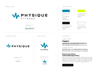
To convey a premium look and feel, and to signal that Physique Fitness was a gender-inclusive space, I chose a strong geometric typeface for the business name, and paired it with a playful and vibrant icon — pulsing with passionate energy in an intense blue hue, and together conveying strength and prestige with a little bit of attitude.
Drawing on the idea that members of Physique Fitness are goal-getters who never quit, the zig-zag-esque icon implies dynamic forward momentum, and represents the beating pulse of the brand — that Physique Fitness isn't just another gym facility, but that it's a brand that really cares about helping members along on their health journey.
Email me at
if you're a fitness brand in need of an identity design system that will help you communicate your vision and message consistently.
