Progress Indicator & Form Design
Day 9 of #DesignChallenge
Prompt: Progress Bar
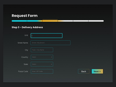
In this design, I've used gradients to indicate the progress of a user's journey through filling a form. I've highlighted the current stage in yellow and the completed sections in turquoise.
Follow me on Twitter here for more design-related updates!
More by Kavya View profile
Like
