Tranquility
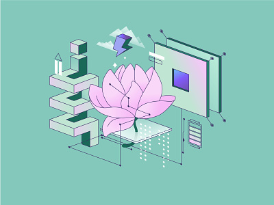
Іllustration is becoming multidimensional and interactive. Its main function is to be the "trigger" for the brain, namely, to grab attention. But not with bright, screeching colors. Gradient palettes are great alternative when you want something flashy, but not too flashy. Gradient color is when one shade blends seamlesly to another. Whereas the green palette is used to symbolize nature, the mint blue that we used for background here can be interpreted as a symbol for tranquility. This illustration will fit any app or website.
Have a project in mind? Contact us.