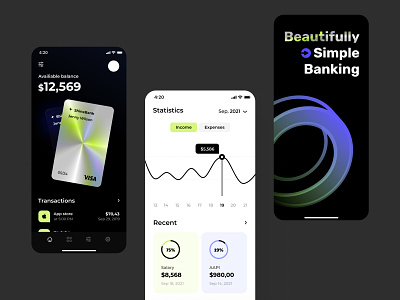
Simple banking app design
Hey all,
The simpler the application, the better the application — right? Or am I saying something wrong? :-) I thought for a long time about presenting a new application for online banking, and that’s what I came up with.It is a mixture of 2 themes and now you no longer need to choose a dark or white background. How do you like the design of the card? What about bright accents? The perfect balance between all design components and striking accents. I have been collecting this design for a long time, and I am delighted with how great it was. Waiting for your reactions!
Design — Figma
*************
💌 I am open to new projects! hey@migulko.cz
************
More by Taras Migulko View profile
Like
