Tommy Hilfiger App Design
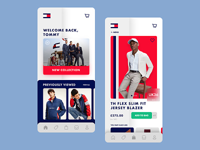
Following Tommy Hilfiger's colour scheme, with a personalised welcome screen of the user's name alongside relevant clothing items the user was interested before. UX that can incline the user to be more likely to purchase such items.
Viewing the item, the user is able to see items that users may purchase alongside that item such as a handkerchief or cufflinks alongside a blazer. Clear call to action to lead to convert a potential buy to a purchase from the user.
Made in 2020
More by Mitesh Jethwa View profile
Like
