Daily UI 050 - Job Listing
Challenge 050: [no description was given]
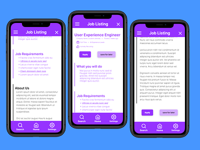
Created a type of job listing you might see on a job site like LinkedIn. The main call to action button is the Apply button, so I made it purple to fit in with the theme, placing it near the center of the screen to attract the most attention. The Save For Later button has a lower priority, but is still important. So I chose to make it a more faded purple than the Apply button.
I made sure to place the What You Will Do and Job Requirements sections on top. This can help applicants more quickly deduce whether they're a good fit for the role than if they were placed lower. From there, the About Us section is placed on the bottom since it has the lowest priority. While it is important for applicants to know about the company they are applying for, I believe it has a lower priority than whether or not they should apply to the company in the first place. This is also why I chose to have it in black font as opposed to the light purple font that the previous sections have, as the purple will stand out more to the user.
The Apply button and the Save For Later buttons are placed again at the bottom of the screen to reinforce their importance while still allowing the user to view all of the text. I specifically chose to have it at the top and bottom rather than having it stick to the screen while scrolling to provide as much breathing space for the actual screen content as possible.
This prototype was made in Framer.
