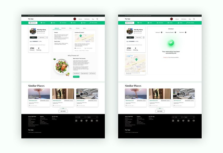
Restaurant Profile and Payment Feedback UI Design
I love working with bright colors. It gives me an opportunity to showcase my creativity and plot out my information architecture with fewer elements. As a (minimalist) designer, you don't want to feed your users with too much (bright) colors, it's bad for their eyesight and can destroy a good user experience.
More by Ojo Opeyemi View profile
Like
