Credit Card Checkout
Daily UI -002
Credit card checkout
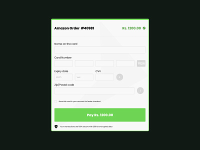
Most of the fields were easy to design. Important design decisions that were involved in this were:
1. Top text: The top text containing the order number and the order amount. The company name should be visible at the top and the order amount always in sight assures the user. There is an edit option also with the amount. A user can edit the amount to be paid in this form also.
2. Card type: The card type like Visa, or mastercard etc. that appears when user fills in the card number. I added Visa here which is just a placeholder for other cards as well. As user fills the card number, system automatically detects the card type and that card is displayed beside the field.
3. CVV: We are often confused about CVV as different cards have different ways to provide this. So to alleviate the issue I added a simple info button on clicking which a popup would open showing the user where he can find his CVV. This is linked to the credit card type as the system already detects the card type above so the popup here would be relevant to that card type only.
4. Security message: The shield symbol shows user that the transaction is secure.
