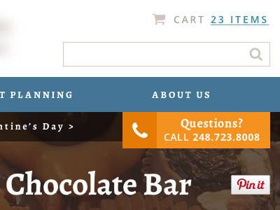
Chocolate Company Header WIP
Going through some color variations for a new website's header. I like simple (top option), but there's a lot going on between the menu, breadcrumbs, and page title, so I thought a bold color to bring out the menu would work. Would love to hear some thoughts.
See the attached image for all the options.
More by Solve Design View profile
Like

