Western Orthopedics
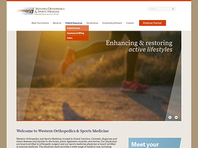
Taking what I had to work with (the logo), it had a diagonal shape to it that I worked into the homepage slider and a few buttons to communicate a sense of forward motion which will be complimented with forward moving transitions, loading bars, photos, etc.
The colors create a warm and inviting feel instead of a stark medical feel you typically see.
The rest of the page goes on to highlight their community involvement with the college, sports teams and schools, which really sets them apart.
Feedback would be lovely much appreciated!
More by Robyn Britt View profile
Like
