Veiligbankieren.nl website redesign


Client
Betaalvereniging Nederland - Veiligbankieren.nl
Industry
Banking and financial
Year
2020
Description
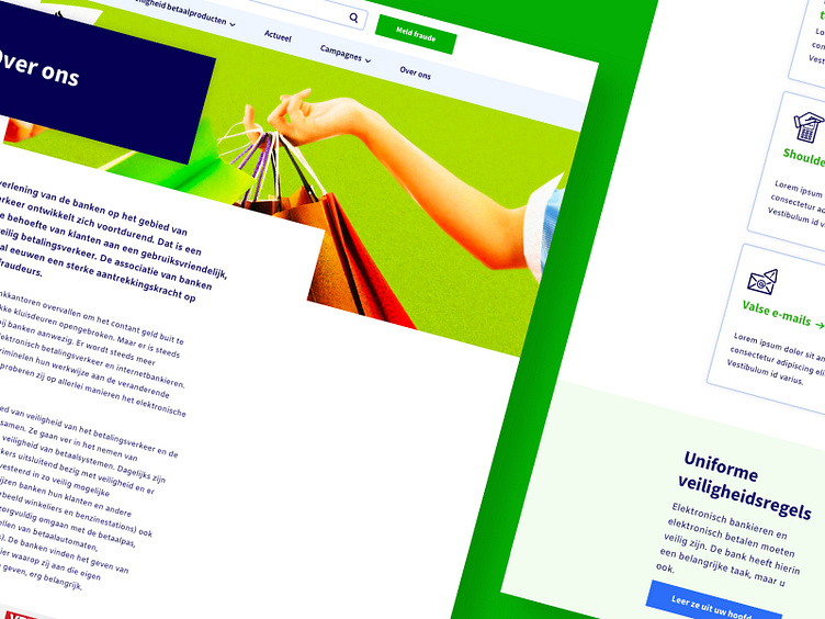
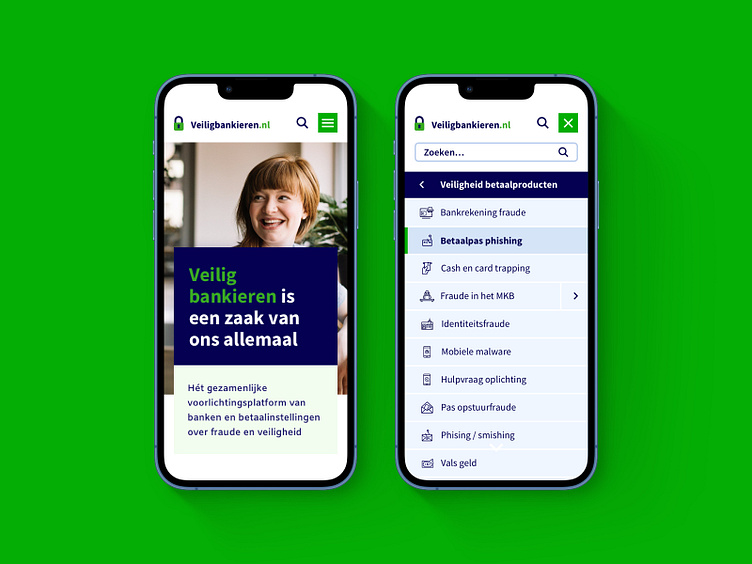
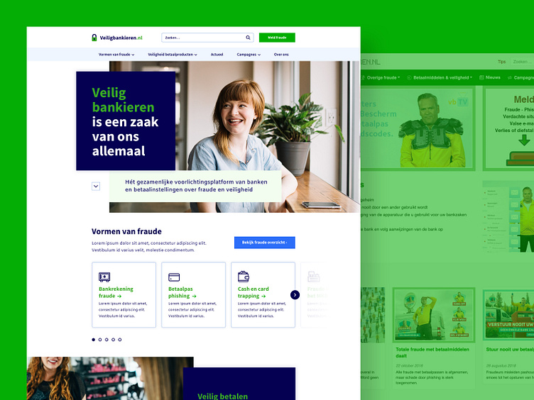
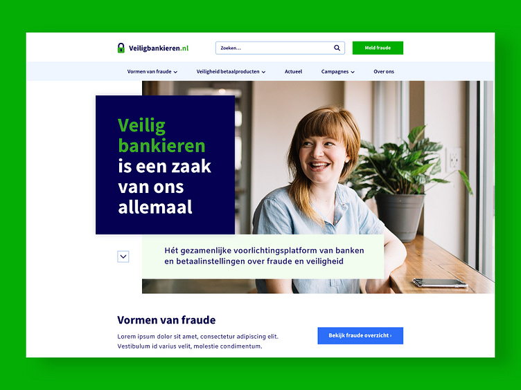
The veiligbankieren.nl website, designed by Clearsite a couple of years ago, was labeled outdated in regards to design and usability. And when the client has plans to intensify their campaigning, the website should be up-to-date for an increasing amount of (new) visitors. Time for a 'subtle' overhaul! 🪄
The challenge was to make the design up-to-date with the current standards while making sure usability is preserved for the average 'elderly' target group. Secondly it was important to have more emphasis on reporting on- and offline fraud and having easy access to the precautions you can take to not become a victim. 🚨
Solution
• An authentic brand identity that embodies trust and safety.
• Visually attractive content to make navigating easier and more accessible.
• A clear & visual (main) navigation to easily navigate to the different forms of fraud and payment products;
• Report fraud from any page with the main CTA button in the header;
With this solution we make sure veiligbankieren.nl is the 'go-to' website for topics regarding on- and offline fraud. 🖥️
* icons were designed by my colleague.
Client
Betaalvereniging Nederland - Veiligbankieren.nl
Industry
Banking and financial
Year
2020
Description
The veiligbankieren.nl website, designed by Clearsite a couple of years ago, was labeled outdated in regards to design and usability. And when the client has plans to intensify their campaigning, the website should be up-to-date for an increasing amount of (new) visitors. Time for a 'subtle' overhaul! 🪄
The challenge was to make the design up-to-date with the current standards while making sure usability is preserved for the average 'elderly' target group. Secondly it was important to have more emphasis on reporting on- and offline fraud and having easy access to the precautions you can take to not become a victim. 🚨
Solution
• An authentic brand identity that embodies trust and safety.
• Visually attractive content to make navigating easier and more accessible.
• A clear & visual (main) navigation to easily navigate to the different forms of fraud and payment products;
• Report fraud from any page with the main CTA button in the header;
With this solution we make sure veiligbankieren.nl is the 'go-to' website for topics regarding on- and offline fraud. 🖥️
* icons were designed by my colleague.