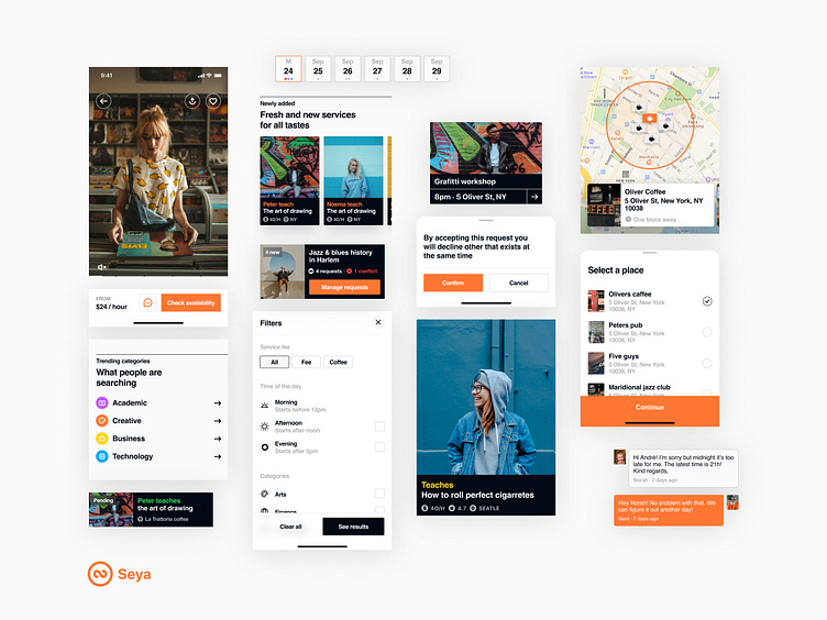
Seya – Components
Seya's interface gained inspiration from the NYCTA Graphics Standards Manual, which describes the design and construction of New York's subway signs.
Seya’s interface is colorful and bold, incorporating different colors like orange, blue, yellow, and green. Everything is balanced out with dark grey tones.
If you liked this project please leave us a like and a comment. 👍🏼 💬 You can follow Coletiv on Twitter and Instagram and be sure to follow us here for more shots. 🏀
To work with us, just reach us here.
More by Raquel Pontes View profile
Like
