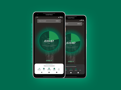
Horse Bank App | Dashboard Screen
This is pretty much the Starling Bank app Dashboard except a few things that I took from Lloyds bank app Navigation Bar and Account selector is a slide. Starling bank have a unusual dropdown and icon that can do the same. I don't understand why so I did a swipe selector that looks better, though instead of current amount I should place account number. Made in Figma, check out all screens I have prepared 😉.
More by Lilly Cookie 🍪 View profile
Like
