UNIQLO App Redesign
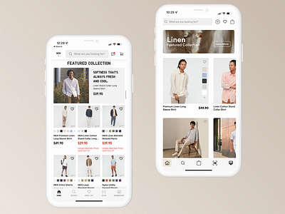
This is my UNIQLO iOS App Redesign. The original is on the left, and the updated version on the right.
The idea behind this was to eliminate the noise in the old version. The Featured Collection was not obvious, so I created a simple, soft-cornered card with three main items on there, a title, subtitle, and call-to-action.
One of the other big issues was that you couldn't see the shirts the models were wearing, so I took those images and expanded them. Users still get the colour selection choice, but now have a nice, minimal product title below the image.
I've also eliminated a lot of the noise on the bottom navigation bar. The icons have grown and the text eliminated. Again, this is for the purpose of decluttering.
