Simplified Google Maps Case Study


Welcome to my Simplified Google Maps Case Study!
Introduction —
For this case study, I was challenged to pick an existing app and make a version of the app easier to use for a 70+ year old. I needed to keep the same general features. I decided to go with Google Maps since it's a complicated app that involves a lot of small text and features. I wanted it to have big clickable buttons and easy navigation.
Step 1 — Goals
✅ Make Google Maps more user friendly for a 70+ year old
✅ Preserve key features of Google Maps
✅ Provide a clear explanation for the possible options
✅ Do not overwhelm the user with too many options
✅ Allow the user to start driving to their destination in as few as 2 clicks
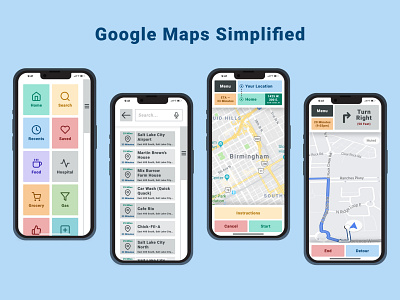
Step 2 — Research & Review
I reviewed Google Map's UI and narrowed down this project to just 4 pages:
Home
Search
Route
Directions
I also researched on Dribbble's website for various "simplified" UI designs and took note of their strengths and weaknesses.
Step 3 — Sketch
I started sketching some ideas I had for the 4 pages. I tried to simplify the steps and put myself in the shoes of a 70+ year old. I didn't want it to have too many features and I wanted the pages to be easy to understand and navigate.
Step 4 — Exploration
From my research and sketches, I started creating wireframes and surface compositions. I started mapping out the flow for the pages and I made multiple iterations along the way. I reflected on my goals throughout this process and made sure it would be easy to understand. I had other people review my wireframes and get their thoughts and opinions. I continued exploring and designing.
Step 5 — Design
Now that I have a set wireframe, I started adding icons, text, and color to my design. I tweaked my wireframes, icons, text, and color throughout this process and made sure they were aligned with my goals and research.
Step 6 — Prototype
I created a prototype of my designs at this point and started testing out the pages and how they would work together. If this was a real project, I would want to test this with actual users and get their feedback. I continued to modify my designs after I gathered more information from the prototype. You can view the prototype here!
Step 7 — Iteration
I plan on adding more pages to this project and testing the prototype with more users to gain more feedback. I have a lot of ideas for future updates and features that I want to implement. I would want to make the actual map and directions simplified as well.
Conclusion —
I really enjoyed doing this project and I hope you have enjoyed reading through this case study. I feel that this UI will help the older generation get to their destinations and not be frustrated with the app.
If you would like to review the Figma file I used for this project, check it out here! This case study took me 6 hours to complete. Enjoy!
