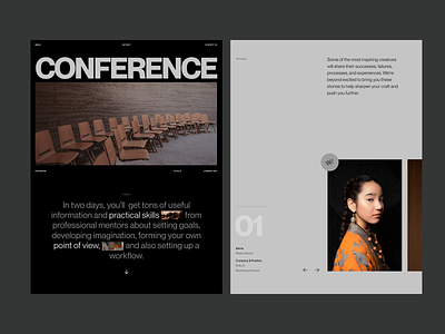
Design Conference Promo Page
Hello there,
We work hard in Zajno to set impossible goals and achieve them without a doubt. This is also one of the main subjects of the conference, which I created the visuals for.
It’s always important to develop imagination in different directions and discover something new, so I refused the usual decisions in design and concentrated on layout, grid and building blocks. The text works with the image as the partners in dance complementing each other. I worked in Figma to highlight only vital information and distinguish minimalist color palettes.
The promos of the conference are now carefully translated in a form of shadows like it’s a film about to start. I like to share this feeling of anticipation with you, because nothing catches an eye like light and dark working in full synchronization.
Do share your feedback – I would really appreciate it!
P.S. Many thanks to Andrey for helping with the shot!


