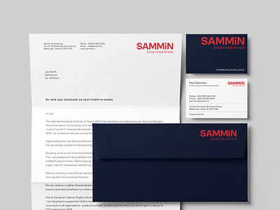
Sammin Engineering Stationery
Visual identity redesign for Sammin Engineering. A dynamic electrical, security, and specialist engineering services company.
Sammin Engineering provide their clients with maintenance, project electrical, and security services across the residential, commercial, industrial, and institutional sectors. They also provide specialist engineering services for world-renowned products such as DEVI and ZIP.
The existing logo was used in various forms since the company was founded in 2005, and no longer reflected the quality services that Sammin Engineering provide. We were engaged to do a full redesign of the brand identity and collateral items, whilst staying true to the existing brand. We agreed to go with a progression of the existing logo rather than a complete refresh. Sammin Engineering has built a solid reputation in their field of expertise and we didn't want to lose that brand awareness.
The redesigned logotype is simplified, customised, and structured. It is modern, bold, and confident. The existing colour palette was also tweaked and developed. There is a common colour palette amongst electrical engineers, and right from the start, Sammin Engineering stepped away from this with their use of red. We tweaked this shade of red and paired it with a deep navy as a nod to the industry.
We also developed a pattern that could be used for printed collateral and online use. The pattern created is linked back to the dashed lines of the business card. It suggests movement, connectivity, and electrical currents. It feels busy without being too distracting.
Various other bits of the project included vehicle graphics, workwear, and safety items.
Full project: https://www.colmoconnor.com/project/sammin-engineering
