Udemy Landing Page Redesign
💌 Have a project idea? We are available for new projects info@ronasit.com | Telegram | WhatsApp | Facebook | Linkedin | Website
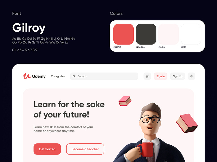
Udemy is an online learning and teaching environment that helps you to study something new and share your knowledge. We love their illustration style and wanted to give their homepage a makeover. Here's the result.
The shot shows the Udemy landing page with a big banner that has a catchy call-to-action phrase and signup buttons. The banner is followed by platform perks and the most popular courses.
We picked the established style of the current Udemy website with white background and use of illustrations but added red as the second main color to bring more life to the page.
This revamp aims to re-organize the space of the Udemy landing page and create a more engaging look that makes visitors of the website explore it and try using the platform.
Do you like our redesign?