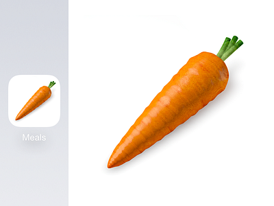
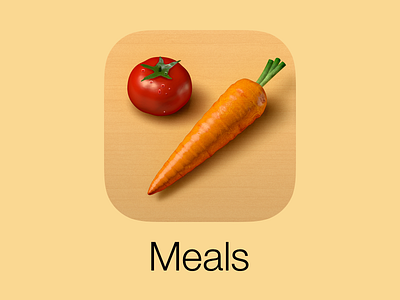
Veggie Meals Refreshed Icon
The changes from Veggie Weekend were carried across to all of the icons. This is the one I struggled the most with, but I finally let go of the wooden texture and tomato. I'm torn since I feel the original iOS 6 icon (https://dribbble.com/shots/421828-Refreshed-Veggie-Meals-icon) was a great icon in and of itself, but there's a point in sticking with the tides of design trends, and this is more in line with iOS as of late. Not doing a force perspective on the icon makes it fit in and play nice with the rest of the icons. The carrot was thickened up slightly, and the stems shortened a bit to occupy more space in the super-ellipse.
Learn more and download here:
https://itunes.apple.com/us/app/filibaba-meals-simple-vegetarian/id495582698?mt=8
More by Filibaba View profile
Like

