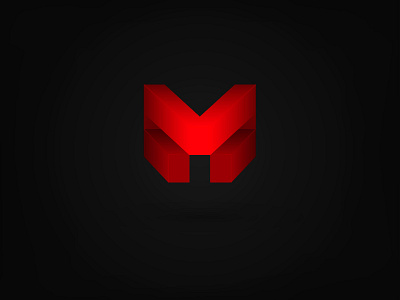
M logo
Logo for construction company based on Brazil
The mark is made of the combination of the letter M (company first letter) + a building that represent solidity, stability and trustworthy.
The concept for their new identity aims at being fresh, modern and bold. Soon I will upload the rest of the identity project.
More by Dainin Solis View profile
Like
