Reetmatik Logo Design

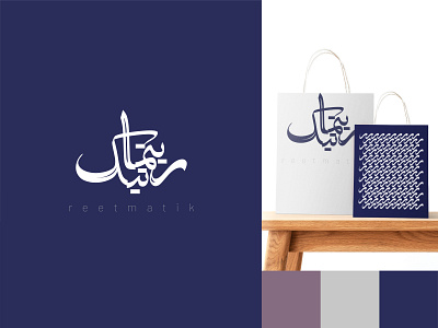
Reetmatik is a cultural foundation in the field of literature and music. Reetmatik means rhythmic. in the design of the logo 2 concepts are considered:
1. Use of traditional Iranian calligraphy (according to the field of activity of this brand).
2. The rhythmic nature of the logo.
The visual identity of the brand is formed around the repetition of the letter "ر" in the Iranian alphabet.
It was a complete Visual Identity Design, you can check on on my Behance