Wasted Year Font
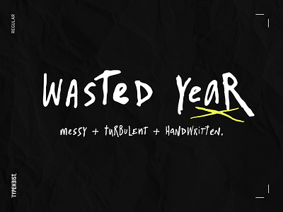


It’s messy, turbulent, handwritten. With over 350 glyphs.
Why does it look so realistic?
Hundreds of handwritten custom letter combinations make this font look like it was scrawled with a pen, not typed with a computer. These characters belong next to each other... that’s how the natural flow and messy style is achieved. You won't see many duplicate letter styles here.
View font on typeheist.co