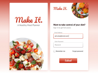
Make It - Sign In Page on Mobile
Day 4 of #DesignChallenge
Prompt: Sign In / Login Page
I conceptualised a 'healthy meal planner' app that helps users develop a healthier lifestyle with more nutritious meals added to their diet.
Design element for this brand is gradient. I used it in the logo, buttons as well as borders for input fields. I kept the gradient subtle, so as to not make it very jarring.
Typography:
Logo, buttons: Pacifico
All other text: PT Sans
More by Kavya View profile
Like
