Letícia Fais Logo


People often ask me about how I do my Brand Guidelines for the Logo I’ve created, so I decided to show a bit here done for Letícia Fais Piano Studio.
I’m very lucky to be found by such talented and open minded people to take care of their identity creation because there’s always plenty of creative freedom, and this is a fundamental component to accomplish an innovative and effective amalgamation with all client visions and perceptions for their brand.
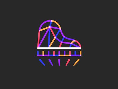
As you can see Letícia’s Logo is intricate and colorful, and also has some blending effects (multiply/overlay) applied to its identity, which isn’t usual and I’m grateful she understood (actually we created this together haha) and trusted me to make this experiment happen.
This dreamy idea of an abstract piano made of spotlights couldn’t work otherwise, and I’m so happy with the result!Here you can see some of the main usage guidelines a simple #brandbook needs so clients can easily make their logo on the way: restricted versions, icon set, business card, color settings and for this specific case of course we’d need some musical sheet (which I loved!)
Let me know what you people think about the result, I’ll be glad to know your perceptions :)
Need a logo, illustration or other crazy stuff? Email me now :)
-
Follow & Connect!
Behance • Instagram • Facebook • Twitter
Thank you, I hope you like it :)