Daily UI 009 Music Player
Daily UI challenge day 009 Music Player
Prompt:
Design a music player. Consider the controls, placements, imagery such as the artist or album cover, etc. Also, consider the device type that's playing the music. A dashboard in a tourbus, a smartwatch, or via a web browser. Each device type will have different requirements, features, and restrictions to consider.
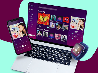
Considering the different device types, I designed this UI for the devices on which a music app is used most widely, desktop app, smart phone and smart watch.
In the desktop app the UI is divided in three sections, fist column contains the profile options, like playlists, liked songs, etc. in the center is the vertically scrollable area for trending songs, recently played and playlists and the last column is for main music player area. For mobile layout I've shown the layout of music player with all the essential options the user might need while listening to songs which is same as the desktop app's last column. If the user needs to access profile, playlist or other option he can navigate to it by simply tapping on the down arrow placed at the top left corner. For easy access to pause and play I've also designed UI for a smart watch which displays the name of the song and the album/singer along with player icons.
Let me know your thoughts on this and press 'f' if you like it, thank you :)
Have a nice day!
